Sunday 28 April 2024

Initial Test of Trading Forex News Announcements

My first test of trading forex news announcements is to test the efficacy of breakouts immediately following a news announcement related to the US dollar, specifically, only the high impact news as shown on the forexfactory calendar in red. The intention would be to capture some of the profit available from the big movements resulting from surprise news or simply market manipulation around these new events.

Rather than conduct a standard back test of a specific set of entry/exit rules to produce a single equity curve and test metrics, I decided to conduct a Monte Carlo simulation of R multiple returns, given that a news breakout occurred, across the following forex major pairs with USD as one of the pair, i.e. EUR-USD, GBY-USD, USD-CHF, USD-JPY, AUD-USD, NZD-USD and USD-CAD. I assumed that all the above pairs would collectively constitute one trade in the USD with a 1% risk in total, so each pair was allocated a 1/7th of 1% risk R multiple for each and every USD news announcement. 

Whether a breakout occurred or not, the R multiple risk, and whether or not the trade would have been ultimately profitable was independently simulated thus for each of the above pairs:

  1. On the 10 minute OHLC bar close immediately prior to the time of the news announcement a simulated buy order and a sell order were placed a distance of 1x the close to close variance above and below the bar close, this variance being determined by the output of my kalman_ema function
  2. The 1/7th of 1% risk R multiple was taken as the distance between these two entry orders, with each entry order having an attached protective stop-loss at the other entry order's level.
  3. On the next 10 minute OHLC bar, assumed to be the bar that should show the reaction to the news, if neither of the entry orders are hit it is assumed that no trade would have taken place. This would be functionally equivalent to cancelling the entry orders 10 minutes after placing them if no news reaction in price occurs.
  4. If the next 10 minute bar hits both entry levels, it is assumed that a whipsaw trade would have occurred and this is booked as a -1R losing trade. In all the simulations that follow, this trade will always be a -1R loss.
  5. If neither of the conditions in 3 or 4 above are met, it follows that one of the entry levels would have been hit and not stopped out on the entry bar. In this case, the maximum favourable excursion (MFE) of the high (for long entries) or low (for short entries) over the next 24 10min OHLC bars (4 hours) is recorded in terms of its R multiple value.
  6. Simultaneously with 5 above, it is recorded whether or not at any time in this forward looking 24 bar period this trade's entry protective stop level would have been breached. 
  7. The simulation now starts: all -1R trades from step 4 are kept as -1R losing trades.
  8. All trades that are flagged as having hit the stop level from step 6 have a random 50% chance of being booked as a -1R loss. This simulates being stopped out before the MFE is reached, or alternatively, completely messing up and missing a take profit opportunity and then riding the trade to a loss.
  9. All trades flagged from step 6 that are not booked as a -1R loss in step 8 have their MFE randomly multiplied by a value on the interval 0 to 1 to simulate being stopped out with a trailing stop. This also applies to trades from step 5 that do not hit stops identified in step 6. During the simulation this averages out to all profitable trades only achieving, on average, 50% of the maximum possible profit.
  10. All the trade results are cumulated into a total R multiple profit/loss across all the forex pairs per news announcement and then a percentage return equity curve is calculated and plotted, an example of which is shown next, with a log scaled y-axis and a thousand Monte Carlo replications. 

This following chart is the accompanying drawdown chart to the above equity curves chart, expressed as a percentage drawdown of the on-going, equity curve high water mark on the y-axis.
Taking the average equity curve ending value and the nth root of the number of trades, the average expected, cumulated R multiple return per news announcement is approximately 0.38R profit per 1R risk.
 
The above was not intended to be a test of a specific rule set per se, but rather a test of whether or not attempting to trade forex news announcements could be profitable. What the above shows is that essentially random exits could be profitable exits for a news breakout system, and so the assumption must be that intelligent exits, either take profit or stop loss, coupled with breakouts would make a viable trading system.
 
More in due course. 


Friday 19 April 2024

Trading Forex News

This post, as the title suggests, is about trading forex news releases and, incidently, is a small update to the appearances of my PositionBook chart and OrderLevels chart.

I recently came across this forexfactory post which shows how to download the underlying data for the forexfactory calendar, a screenshot of which is shown immediately below, and I thought I would look into the idea of trading around forex news

releases. If you look carefully at the screenshot you will see that at 2.30pm (CET) there was a high impact (red folder icon) news release regarding the Canadian dollar (CAD) which came in under expectations. The following OrderLevels chart
and PositionBook chart
clearly show the big move that immediately followed this news release (CAD weakness). The OrderLevels chart also shows the accumulation of sell orders (red background colour) that would have been an almost perfect take profit level for the day, whilst the PositionBook chart shows the accumulation of long positions (blue background colour) during the sideways movement that preceded the news release. These two charts both show the above mentioned appearance update resulting from the use of the b2r colormap function.
 
The following "overview" chart shows that the big move in the USDCAD forex pair was
definitely the result of this CAD weakness rather than USD strength (see the two rightmost currency strength charts).

Having finally "scratched the itch" of getting my PositionBook charts sorted out, my next project is to investigate the possibility of creating a forex news release trading methodology.
 
More in due course.

Tuesday 9 April 2024

A "New" Use for Kalman Filter on Price Time Series?

During the course of writing this blog I have visited the idea of using Kalman filters several times, most recently in this February 2023 post. My motivation in these previous posts could best be described as trying to smooth price data with as little lag as possible, i.e. create a zero-lag indicator. In doing so, the model most often used for the Kalman filter was a physical motion model with position, velocity and acceleration components. Whilst these "worked" in the sense of smoothing the underlying data, it is not necessarily a good model to use on financial data because, obviously, financial data is not a physical system and so I thought I would apply the Kalman filter to something that is ubiquitously used on financial data - the Exponential moving average.

Below is an Octave function to calculate a "Kalman_ema" where the prediction part of the filter is just a linear extrapolation of an exponential moving average and then this extrapolated value is used to calculate the projected price, with the measurement being the real price and its ema value.

## Copyright (C) 2024 dekalog
##
## This program is free software: you can redistribute it and/or modify
## it under the terms of the GNU General Public License as published by
## the Free Software Foundation, either version 3 of the License, or
## (at your option) any later version.
##
## This program is distributed in the hope that it will be useful,
## but WITHOUT ANY WARRANTY; without even the implied warranty of
## MERCHANTABILITY or FITNESS FOR A PARTICULAR PURPOSE.  See the
## GNU General Public License for more details.
##
## You should have received a copy of the GNU General Public License
## along with this program.  If not, see .

## -*- texinfo -*-
## @deftypefn {} {@var{retval} =} kalman_ema (@var{price}, @var{lookback})
##
## @seealso{}
## @end deftypefn

## Author: dekalog 
## Created: 2024-04-08

function [ filter_out , P_out ] = kalman_ema ( price , lookback )

## check price is row vector
if ( size( price , 1 ) > 1 && size( price , 2 ) == 1 )
 price = price' ;
endif

P_out = zeros( numel( price ) , 2 ) ;

ema_price = ema( price , lookback )' ;
alpha = 2 / ( lookback + 1 ) ;

## initial covariance matrix
P = eye( 3 ) ;

## transistion matrix
A = [ 0 , ( 1 + alpha ) / alpha , -( 1 / alpha ) ; ...
       0 , 2 , -1 ; ...
       0 , 1 , 0 ] ;

## initial Q
Q = eye( 3 ) ;

## measurement vector
Y = [ price ; ...
       ema_price ; ...
       shift( ema_price , 1 ) ] ;
Y( 3 , 1 ) = Y( 2 , 1 ) ;

## measurement matrix
H = eye( 3 ) ;

## measurement noise covariance
R = eye( 3 ) ;

## container for Kalman filter output
filter_out = zeros( size( Y ) ) ;
errors = ones( 3 , 1 ) ;

for ii = 2 : size( Y , 2 )

  X = A * filter_out( : , ii - 1 ) ;
  P = A * P * A' + Q ;

  errors = alpha .* abs( X - Y( : , ii ) ) + ( 1 - alpha ) .* errors ;

  IM = H * X ; ## Mean of predictive distribution
  IS = ( R + H * P * H' ) ; ## Covariance of predictive mean
  K = P * H' / IS ; ## Computed Kalman gain
  X = X + K * ( Y( : , ii ) - IM ) ; ## Updated state mean
  P = P - K * IS * K' ; ## Updated state covariance

  filter_out( : , ii ) = X ;
  P_out( ii , 1 ) = P( 1 , 1 ) ;
  P_out( ii , 2 ) = P( 2 , 2 ) ;

  ## update Q and R
  Q( 1 , 1 ) = errors( 1 ) ; Q( 2 , 2 ) = errors( 2 ) ; Q( 3 , 3 ) = errors( 3 ) ;
  R = Q ;

endfor

filter_out = filter_out' ;

endfunction
Using this for smoothing either the price or the ema has no utility, but a by-product of the filter is the Covariance matrix from which it is possible to plot bands around the price series. The following chart shows the bands for various ema alpha values corresponding to various Fibonacci sequence length look backs for the ema alpha value.  
This next chart, for purposes of clarity, shows the "Golden Cross" lengths of 50 and 200
and this final chart shows an adaptive look back length which is a function of the instantaneous measured period (see here or here) of the underlying data.

Despite the wide range of the input look back lengths for the ema, it can be seen that the covariance bands around price are broadly similar. I can think of many uses for such a data driven but basically parameter insensitive measure of price variance, e.g. entry/exit levels, stop levels, position sizing etc.

More in due course.


Thursday 21 March 2024

Standard "Volume based" Indicators Replaced with PositionBook Data

In my previous post I suggested three different approaches to using PositionBook data other than directly using this data to create new, unique indicators. This post is about the first of the aforementioned ideas: modifying existing indicators that somehow incorporate volume in their construction.

The indicators I've chosen to look at are the Accumulation and Distribution index, On Balance Volume, Money Flow index, Price Volume Trend and, for comparative purposes, an indicator similar to these utilising PositionBook data. For illustrative purposes these indicators have been calculated on this OHLC data,

which shows a 20 minute bar chart of the EUR_USD forex pair. The chart starts at the New York close of 4 January 2024 and ends at the New York close on 5 January 2024. The green vertical lines span 7am to 9am London time and the red lines are 7am to 9am New York time. This second chart shows the indicators individually max-min scaled from zero to one so that they can be more easily visually compared.

 
As in the OHLC chart, the vertical lines are the London and New York opening sessions. The four "traditional" indicators more or less tell the same story, which is not surprising since their calculations involve bar to bar price changes or open to close intra-bar changes which are then multiplied by bar volume. Effectively they are all just differently scaled versions of the underlying price movement, or alternatively, just accumulated sums of different fractions of the bar volume. The PositionBook data version, called Pos Change Ind, does not use any OHLC information at all but rather uses the accumulated difference(s) between position changes multiplied by volume. For most of the day the general story told by the Pos Change Ind indicator agrees with the other indicators; however during the big run up which started just about 9am New York time there is a significant difference between Pos Change Ind and the others.

In hindsight, by looking at my order levels chart

and volume profile chart
 
it is easy to speculate about what market participants were thinking during this trading day, especially if the following PositionBook chart is taken into account.
 
For the purpose of the following brief "stream of consciousness" narrative imagine it's 7am New York time and looking back at the day's action so far it can be seen that the downward drift of the day seems to have halted with a mini double bottom, and we are now moving up with some new heavy tick volumes having accumulated over the last hour or so, forming a new volume profile point of control (POC). Over the next hour prices continue the new slight drift up with accumulating long positions and at about 8.30am we see a doji bar form on the 10 minute chart at the level of the rolling vwap for the day. Suddenly there is the big down bar, which could conceivably be a shake-out of the recently added longs, targeting the stop orders below, which finishes with an extended lower wick. This seems to be an ideal set-up for a long trade targeting either the old POC, which also happens to be the current high of the day, or the accumulated orders which happen to coincide with the level at which, currently, the greatest proportion of long positions have been entered. 
 
Of course it can seen, in hindsight, that this was a great set-up for an intra-day trade that could have caught almost the entire high-low range of the day as a profitable trade, dependent of course on exact entry and exit levels. This set-up is a synthesis of observations from the volume profile chart, the order levels chart and the position levels chart, along with the vwap indicator. The Pos Change Ind indicator does not seem to add much value over that provided by the more traditional, volume based indicators in the set-up phase.

This is not necessarily the case for the exit. It can be seen that the Pos Change Ind indicator turns down sharply several bars before all the other indicators, and this movement in the indicator is evident by the close of the bar with the long upper wick which makes the high of the day. This sharp downturn in the indicator shows that there was a mass exit of longs during the formation of this bar, made clearer by the following chart which shows the two components of the Pos Change Indicator, namely the
 
"Outside Change" and the "Inside Change." The outside change shows the total net position changes for the price levels that lie outside the range of the bar and the inside change is the net change for price levels that lie within the bar range. The greater change of the two is obviously the (red) inside change, and looking at the position levels plot we can see why. The previously mentioned level of "greatest proportion of long positions" suddenly loses that distinction - a large number of the longs at this level obviously liquidated their positions. This is important information, which shows that sentiment favouring long positions obviously changed, and it can be surmised that many long position holders were happy to get out of their trade at more or less break even prices. Also noticeable in the position levels chart is the change in blue shade from darker to lighter at the price levels within the range of the large price run-up. This reduction in colour intensity shows that those traders who entered during the run-up also exited near the top of the move. Taken together these observations could have been used as a nice short set-up targeting, for example, the then currently lower level of vwap, which in fact was subsequently hit with the day closing at this level.

As I had previously suspected, there is value in PositionBook data but it is perhaps tricky to operationalise or to easily automate within a trading system. It can be used to indicate a directional bias, or as above to show when traders exit positions. Again, as shown above, it can be used to put a new, useful twist on existing indicators, but in general it appears that use of this data is primarily visual by way of my PositionBook chart and subsequent, subjective evaluation. Whilst I am pleased with the potential insights provided, I would prefer a more structured, algorithmic use of this data, as in the third point of my previous post.
 
More in due course.


Wednesday 28 February 2024

Indicator(s) Derived from PositionBook Data

Since my last post I have been trying to create new indicators from PositionBook data but unfortunately I have had no luck in doing so. I have have tried differences, ratios, cumulative sums, logs and control charts to no avail and I have decided to discontinue this line of investigation because it doesn't seem to hold much promise. The only other direct uses I can think of for this data are:

I am not yet sure which of the above I will look at next, but whichever it is will be the subject of a future post.

Thursday 21 December 2023

Judging the Quality of Indicators.

In my previous post I said I was trying to develop new indicators from the results of my new PositionBook optimisation routine. In doing so, I need to have a methodology for judging the quality of the indicator(s). In the past I created a Data-Snooping-Tests-GitHub which contains some tests for statistical significance testing and which, of course, can be used on these new indicators. Additionally, for many years I have had a link to tssb on this blog from where a free testing program, VarScreen, and its associated manual are available. Timothy Masters also has a book, Testing and Tuning Market Trading Systems, wherein there is C++ code for an Entropy test, an Octave compiled .oct version of which is shown in the following code box.

#include "octave oct.h"
#include "octave dcolvector.h"
#include "cmath"
#include "algorithm"

DEFUN_DLD ( entropy, args, nargout,
"-*- texinfo -*-\n\
@deftypefn {Function File} {entropy_value =} entropy (@var{input_vector,nbins})\n\
This function takes an input vector and nbins and calculates\n\
the entropy of the input_vector. This input_vector will usually\n\
be an indicator for which we want the entropy value. This value ranges\n\
from 0 to 1 and a minimum value of 0.5 is recommended. Less than 0.1 is\n\
serious and should be addressed. If nbins is not supplied, a default value\n\
of 20 is used. If the input_vector length is < 50, an error will be thrown.\n\
@end deftypefn" )

{
octave_value_list retval_list ;
int nargin = args.length () ;
int nbins , k ;
double entropy , factor , p , sum ;

// check the input arguments
if ( args(0).length () < 50 )
   {
   error ("Invalid 1st argument length. Input is a vector of length >= 50.") ;
   return retval_list ;
   }

if ( nargin == 1 )
   {
   nbins = 20 ;
   }

if ( nargin == 2 )
   {
   nbins = args(1).int_value() ;
   }
// end of input checking

ColumnVector input = args(0).column_vector_value () ;
ColumnVector count( nbins ) ;
double max_val = *std::max_element( &input(0), &input( args(0).length () - 1 ) ) ;
double min_val = *std::min_element( &input(0), &input( args(0).length () - 1 ) ) ;
factor = ( nbins - 1.e-10 ) / ( max_val - min_val + 1.e-60 ) ;

for ( octave_idx_type ii ( 0 ) ; ii < args(0).length () ; ii++ ) {
      k = ( int ) ( factor * ( input( ii ) - min_val ) ) ;
      ++count( k ) ; }

sum = 0.0 ;
for ( octave_idx_type ii ( 0 ) ; ii < nbins ; ii++ ) {
      if ( count( ii ) ) {
         p = ( double ) count( ii ) / args(0).length () ;
        sum += p * log ( p ) ; }
        }

entropy = -sum / log ( (double) nbins ) ;

retval_list( 0 ) = entropy ;

return retval_list ;

} // end of function

This calculates the information content, Entropy_(information_theory), of any indicator, the value for which ranges from 0 to 1, with a value of 1 being ideal. Masters suggests that a minimum value of 0.5 is acceptable for indicators and also suggests ways in which the calculation of any indicator can be adjusted to improve its entropy value. By way of example, below is a plot of an "ideal" (blue) indicator, which has values uniformly spread across its range
with an entropy value of 0.9998. This second plot shows a "good" indicator, which has an

entropy value of 0.7781 and is in fact just random, normally distributed values with a mean of 0 and variance 1. In both plots, the red indicators fail to meet the recommended minimum value, both having entropy values of 0.2314.

It is visually intuitive that in both plots the blue indicators convey more information than the red ones. In creating my new PositionBook indicators I intend to construct them in such a way as to maximise their entropy before I progress to some of the above mentioned tests.

Wednesday 22 November 2023

Update to PositionBook Chart - Revised Optimisation Method

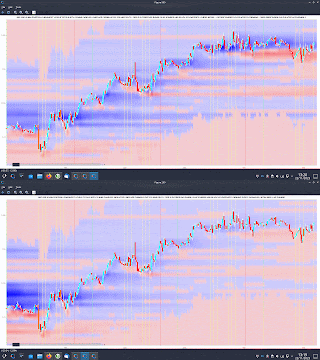
Just over a year ago I previewed a new chart type which I called a "PositionBook Chart" and gave examples in this post and this one. These first examples were based on an optimisation routine over 6 variables using Octave's fminunc function, an unconstrained minimisation routine. However, I was not 100% convinced that the model I was using for the loss/cost function was realistic, and so since the above posts I have been further testing different models to see if I could come up with a more satisfactory model and optimisation routine. The comparison between the original model and the better, newer model I have selected is indicated in the following animated GIF, which shows the last few day's action in the GBPUSD forex pair. 

The old model is figure(200), with the darker blue "blob" of positions accumulated at the lower, beginning of the chart, and the newer model, figure(900), shows accumulation throughout the uptrend. The reasons I prefer this newer model are:

  • 4 of the 6 variables mentioned above (longs above and below price bar range, and shorts above and below price bar range) are theoretically linked to each other to preserve their mutual relationships and jointly minimised over a single input to the loss/cost function, which has a bounded upper and lower limit. This means I can use Octave's fminbnd function instead of fminunc. The minimisation objective is the minimum absolute change in positions outside the price bar range, which has a real world relevance as compared to the mean squared error of the fminunc cost function.
  • because fminunc is "unconstrained" occasionally it would converge to unrealistic solutions with respect to position changes outside the price bar range. This does not happen with the new routine.
  • once the results of fminbnd are obtained, it is possible to mathematically calculate the position changes within the price bar range exactly, without needing to resort to any optimisation routine. This gives a zero error for the change which is arguably the most important.
  • the results from the new routine seem to be more stable in that indicators I am trying to create from them are noticeably less erratic and confusing than those created from fminunc results.
  • finally, fminbnd over 1 variable is much quicker to converge than fminunc over 6 variables.
The second last mentioned point, derived indicators, will be the subject of my next post.